Eyeconic: Magic Mirror
The Problem
Shopping for glasses can be stressful, especially for those who have a hard time finding frames that fit their face properly.
The Solution
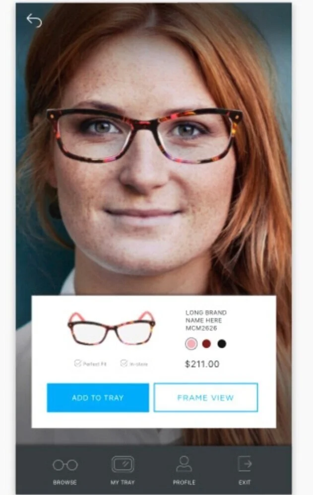
The Magic Mirror scans a user’s face using 3D scanning technology and is able to cross check it with the measurements of the frames in the database in order to recommend the user frames that will fit their face perfectly.
Key Responsibilities
Product Strategy & Roadmapping, , UX/UI Design, User Research, UX Architecture, Prototyping, Usability Testing
Target Persona: Gary, 32
Gary has been wearing glasses for a few years now and always dreads the experience of buying new frames. He wishes that he the entire eye doctor experience could be done from his phone, but knows that finding glasses that fit is a difficult challenge that can result in a big headache later. He is attracted to simple designs and personalized experiences that make him feel like his preferences are taken into consideration.
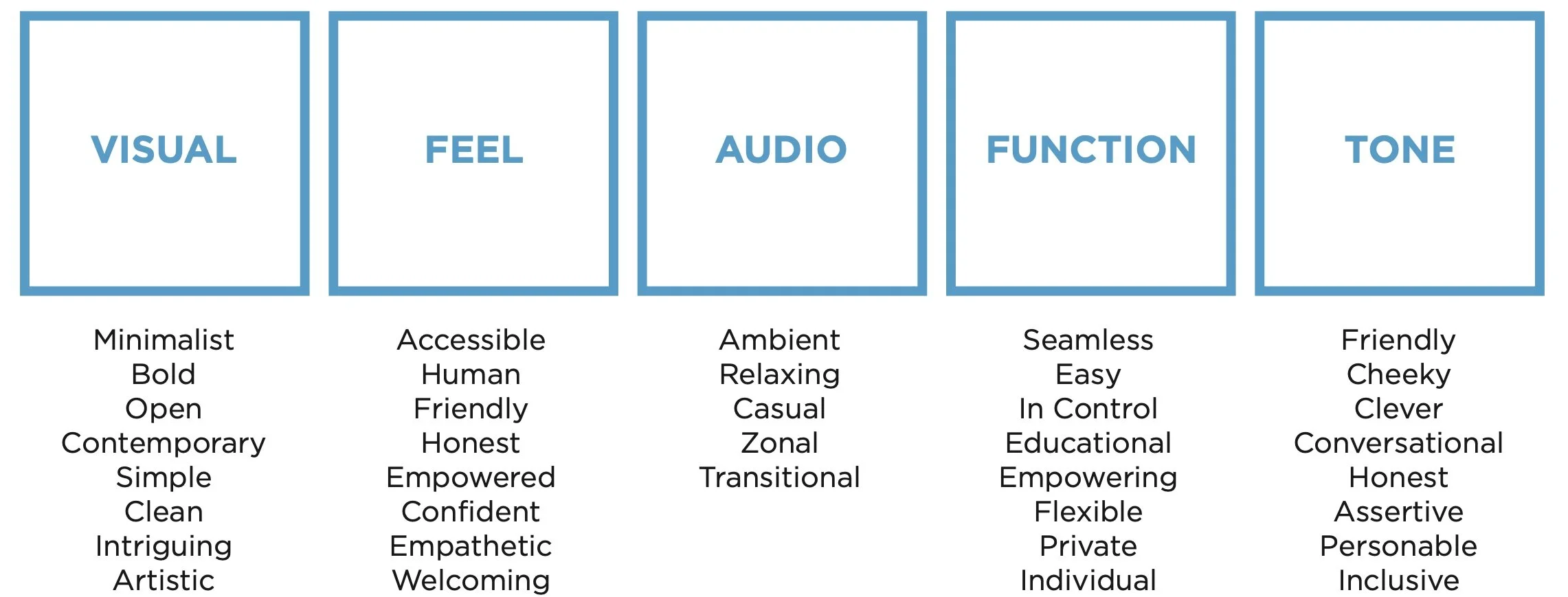
Gary’s Experience Brand Language
User Flow
This was a unique experience that the user interacts with for a short time within the store, but provides incredibly valuable insights into their eyewear profile. The experience includes a face scan, a style assessment, product browsing, virtual try-on, a fit profile (where they can learn how to use their frame measurements and save them for later), and a tray which is the in-person equivalent to a shopping cart.
User Testing
Challenge: Sit or stand?
We found that while the large format screen that users could walk up to and interact with had a bigger impact, the smaller version that allowed them to sit down and take their time felt more comfortable to interact with and more private.
Challenge: UI design for a kiosk
The screen is about the size of a small tv in a portrait orientation, which allowed for a better view of the virtual try on. However, it made the placement of touch points very important. Users wanted to be able to rest their arm on the table while they scrolled and didn’t want to have to reach for any of the buttons.
Challenge: Updated Visuals for existing brand
This experience was designed for Eyeconic.com as they opened up their first brick and mortar locations. They wanted to maintain their brand identity while also capturing a younger, more casual audience.


